Cruise Companion is a mobile application that provides an improved system for Carnival Cruise passengers to easily discover and reserve cruise events based on the user's interests.

Client
Carnival Cruise
Project Type
UX Design
Team
5 students
Timeline
Jan - Mar 2023 (3 months)
About
Problem
Carnival has many potential customers that now bypass traveling by cruise ships as vacationers have changed how they plan trips. In response to this, the cruise line industry has tried to make the cruise ship itself a highlight destination with events and attractions to entice travelers. However, due to the sheer volume of activities and events provided, it is difficult for guests to know what is available and what would most interest them.
Solution
Build an experience to easily discover what activities are available based on their interests, and book them. Our team researched and produced a mock app for Carnival to provide their customers control of how they use their leisure time and what they do while aboard the ship and for them to experience the ship's many events and activities with ease.
Onboard
Discover
Explore
Connect

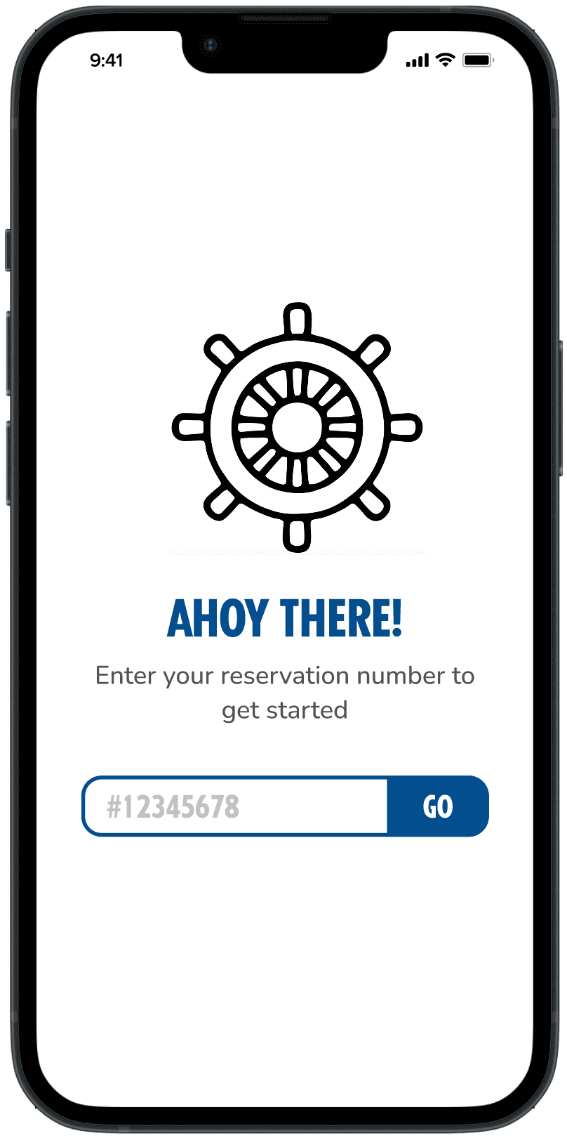


The Onboarding Process
We chose to design a mobile app ensure accessibility wherever you may be on the boat and for all digital literacy levels of users.
Passengers will be met with their cruise reservation number, followed by the pairing of the Medallion provided by the cruise. They can then customize their account to their liking through event interest and personal budget adjustments. This way, they can complete their profile in an easy step-by-step process right at the start.
Research
Brainstorming
We first looked into what would be the goal of Cruise Companion, starting off with what kinds of users we would be introducing the app to and how our app would implement features to make their experience personalized.
Some of our goals included:
Building an experience to easily discover what activities are available based on their interests, and book them
Provide the customer control of how they use their leisure time and what they do while aboard the ship
Experience the ship's many events and activities without an extensive menu of directories or a long calendar program
To begin, we focused on the following scopes for Cruise Companion:
1.
Create a mobile-based tool that will simplify discovery for the target personas.
2.
Activities should be personalized based on their interests.
3.
Guide users in discovering events & activities, then reserving each event.
4.
Ensure there are ways for people traveling together to share and collaborate.
Stakeholders & Personas
To ensure that our app will be user-friendly towards our target audience, we evaluated personas that would be the majority to interact with our app. This allowed our team to make sure we value their interest and time on the cruise during the ideation process. Passengers will be made up of two primary groups: singles and families.


We soley used these two stakeholders as they directly correlated to the type of users we were targeting for our app. Given the nature of cruise ships, we believed that the main types of groups were singles and families, which are those who would most likely be intrigued to use the app for their own personal use.
Ideation
Initial Whiteboard & User Flow
To begin creating a solution to our stakeholders, we started off with a rough outline of what main features the app should present. By discussing what each of us envisioned as a group for Cruise Companion to be successful, this initiation pushed us into our first iteration of the app's development.

Though initially messy, we further developed our ideas by defining what journeys the user may go through when using the app. This helped us construct what each feature would mean to our audience and how they would interact with the feature. For example:
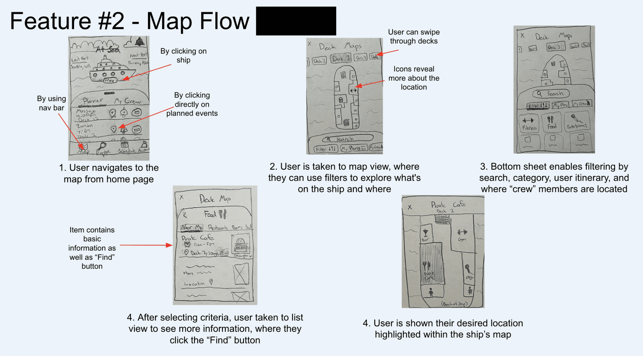

By making multiple prototypes, it allowed us to give a more clear visual of how to produce a coherent theme and user journey. As I iterated through my "Schedule View" sketch, I found that it would be easiest for users to be able to access their confirmed event details through their calendar through just a click, rather than having the user go through typing up a search to find their event for their details. This way, we avoid users from taking unnecessary steps, when the information they want can be shown from one location in one easy course of action.
Usability Testing
Before we continued with the full design process, we interviewed a group of 10+ of casual cruisers and non-cruisers to gather feedback and improve on areas we were currently lacking. This process helped us immensely, as we gathered data about what feasible updates we could make to improve the experience of our future users.
What they liked
Fun, consistent aesthetics and branding
Simple filtering, and personalized activity recommendations based on past activities
The possibilities of the map functionalities
Itinerary customization
What could be improved
A function to easily contact ship staff in case of emergencies
Notification screen for ship announcements
Being able to locate travel group through the map, while keeping privacy a high priority
We proceeded to do additional rounds of feedback through every iteration, averaging around 3 rounds of interviews.
Takeaways
This project proved to be a learning curve for me in developing skills on how to consider a user's perspective when they start their journey with our application design. It became important for me to recognize what design choices would make sense for a wide range of users, and what purpose each design implementation should hold. As a team, some takeaways we discovered include:
The customer comes first • By embracing user-centered design, we learned to collect solutions based on our customer interest to make meaningful impacts on their lives. In order for our design to be user-friendly, we had to thoroughly understand the user's interest through personas and multiple interview processes of potential stakeholders.
A failed design is not a failure • We believed after every iteration, that one was the best final iteration. But through various user testings, we quickly learned how that design actually missed another user need. Rather than taking it as a "back to square one" thinking, we approached this setback as a stepping stone to a better final design.
Understanding design decisions • My team had many ideas we wanted to incorporate into our single app, however, it became difficult for us to make the decision on what features we wanted over others as we all had our own personal design outlooks. By creating an open environment to understand the decisions made by a team member, I was able to not only learn from them, but apply their thinking into my own work and future contributions to the team.